The logo
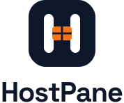
Two versions of one logo. Pick the one that contrasts with what is behind it: the light version (navy tile) on white and light backgrounds, the dark version (white tile) on navy, black and dark photos. The orange pane stays orange in both.


Lockups
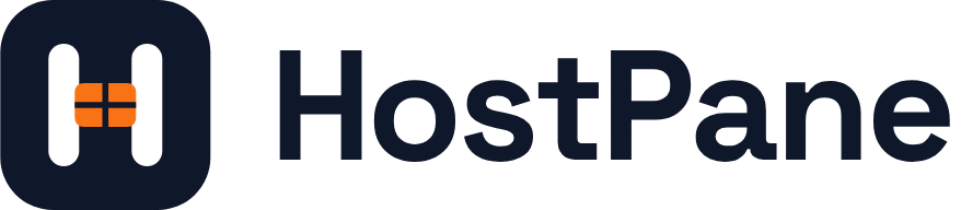
The horizontal logo is the default. Use the stacked logo where the space is closer to square, and the mark alone where the name is already on screen — app icons, avatars, the browser tab.


One colour
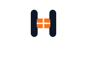
For print, stamps, embroidery, engraving — anywhere only one ink is allowed. The bars and pane are cut out of the tile, so whatever is behind the logo shows through them.



Clear space & minimum size
32 px · smallest logo32 px · smallest mark
 below 32 px · small variant
Colours
Three colours make the logo. On the website, navy is the ink and orange is the accent — used for calls to action and highlights, never as a background for long text.
Typeface
Space Grotesk Bold, letter spacing −3.2 %. The name in the logo files is converted to outlines, so nobody needs the font installed to use the logo. Use Space Grotesk for headings that sit next to the logo; this website sets its headings in it.
Space Grotesk is free and open source under the SIL Open Font License 1.1 — you may use, embed and redistribute it, including commercially.
Do & don't
HostPaneSpecial offer — 3 months freeFiles
Use the SVGs wherever you can: they stay sharp at any size. Everything below is also in the brand kit zip, with the typeface and its licence.




The browser-tab icon favicon.svg switches to the dark version by itself when the browser is in dark mode.